
A world of unprecedented wealth, but unevenly distributed — Explainer #1b
An illustration of the limits of aggregating data


Dear reader,
This is the second article in my series in which I take you on an exploration of long-term economic and demographic data.
In the first article (Explainer #1a), I focused on global data.

Among the many phenomena highlighted in Explainer #1a, I would like to focus on two.
The first phenomenon I want to focus on is the continuous increase in the global GDP per capita since the 19thcentury.
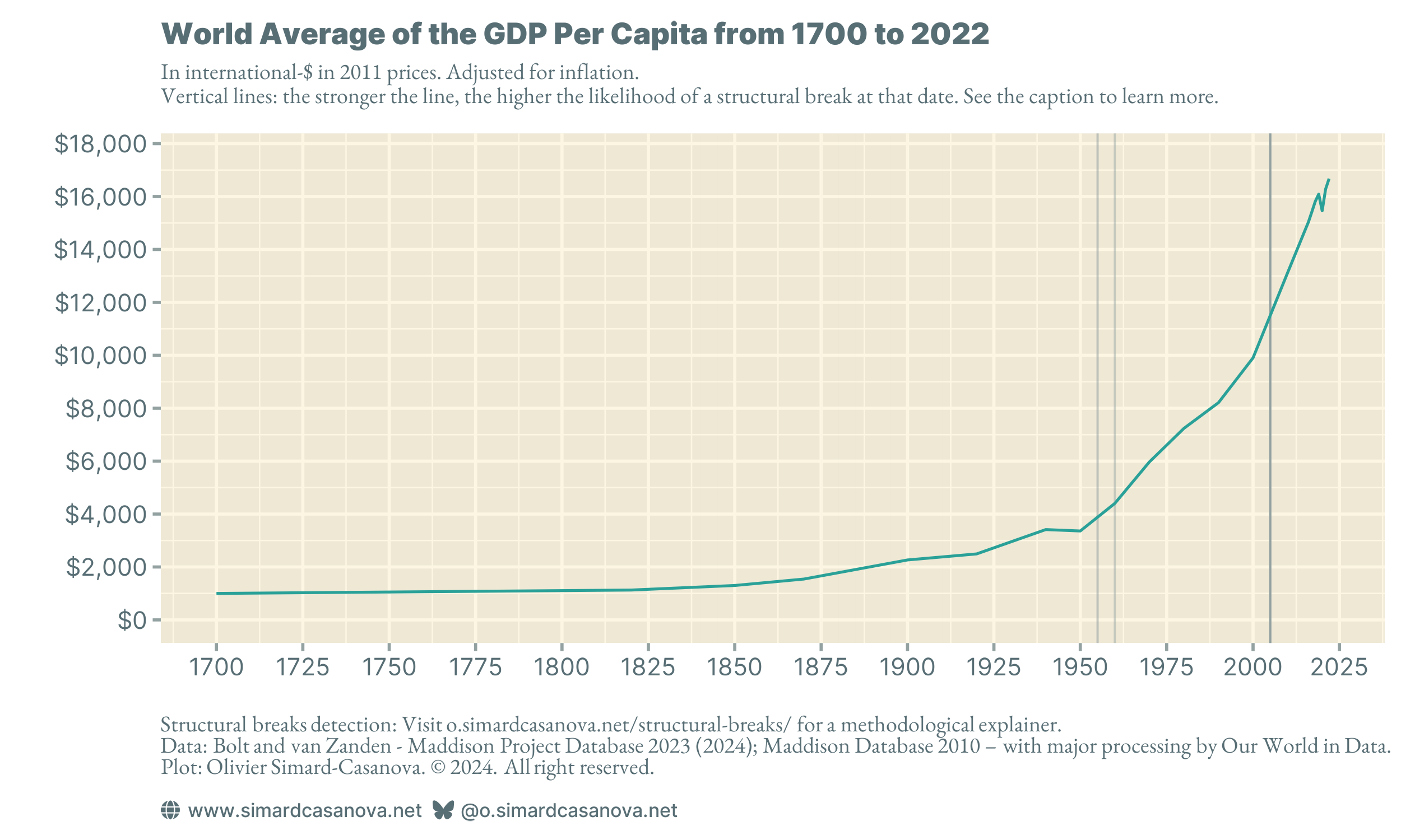
Using the BEAST statistical estimator, plotted in Figure 1 with vertical lines, I identify two structural breaks: a first break in the 1950s, and a second break in the early 2000s. A structural break corresponds to a change in the rate of evolution of a statistical indicator over time. In Figure 1, these two structural breaks correspond to accelerations: the increase in world GDP per capita accelerated in the 1950s, then accelerated again in the early 2000s.
The second phenomenon I would like to focus on is that the growth of the global GDP per capita has not been uniform neither in space nor time. GDP per capita differs, sometimes substantially, from one major world region to another, both in terms of level and in terms of historical evolution.
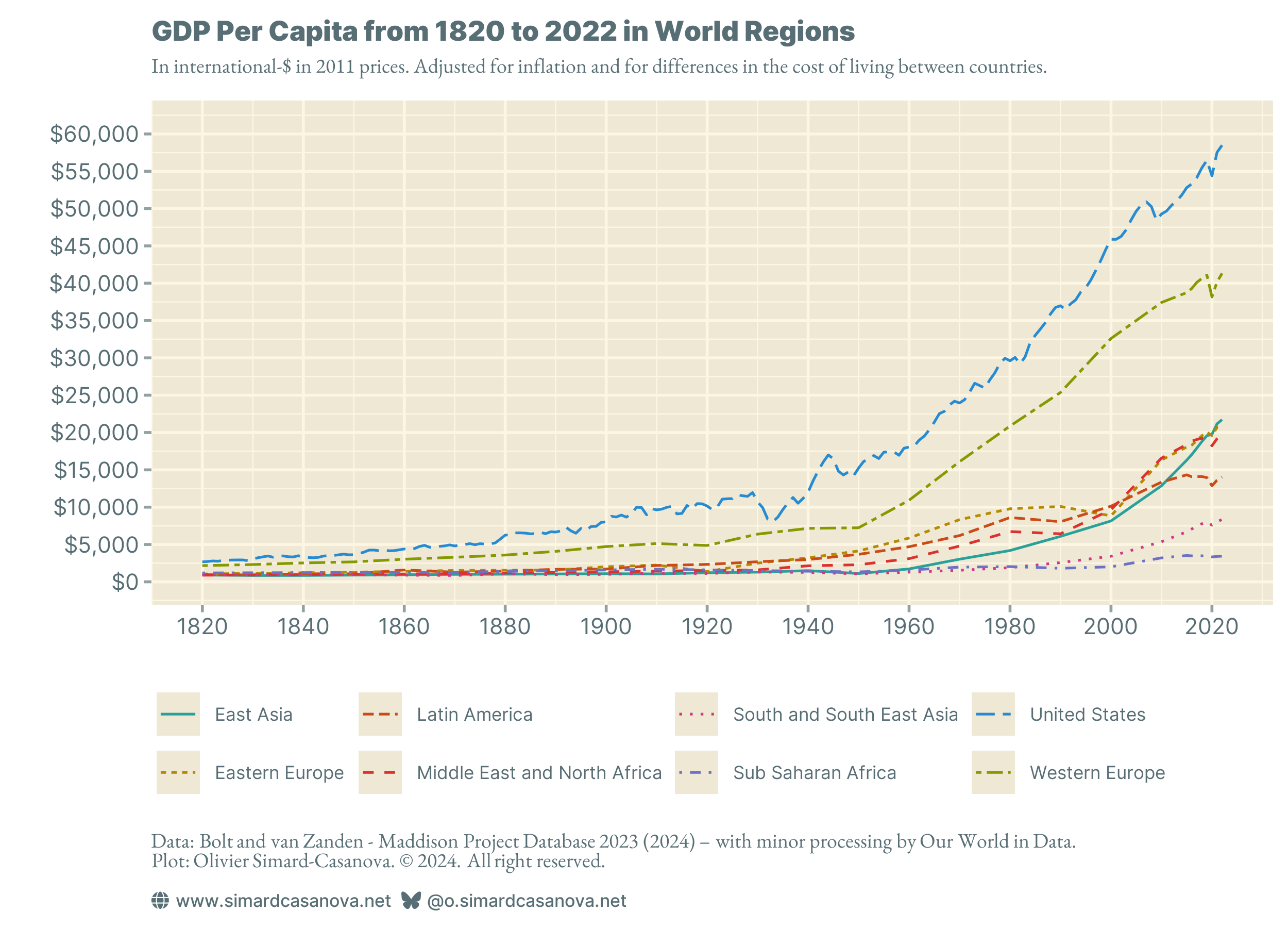
All world regions have experienced an increase in their GDP per capita, but significant disparities remain.
In today's article, I would like to explore the evolution of GDP per capita in the world regions from Figure 2.
• Explainer #1b: World major regions.
• Explainer #1c: Focus on a few notable countries, including France and the United States.
• Explainer #1d: Life before the emergence of capitalism.
A short methodological explainer
In this series of articles, I use the BEAST estimator to detect structural breaks. A structural break corresponds to an acceleration or a slowdown in the evolution of a statistical series over time. The series is not about BEAST, but as I use BEAST a lot, it is worth adding important methodological details about it.
You will see in the article that BEAST is not always accurate. It detects many structural breaks, but not all. It also sometimes detects them, but in a seemingly inaccurate year. Does this mean that BEAST cannot reliably detect structural breaks? Not necessarily.
The inaccuracy of some detections is most likely due to the data I use. First, the data is irregular: there is essentially one observation every five years, with the series only becoming yearly from 2015 onwards. Second, time steps of five years are fundamentally imprecise.
With irregular and imprecise data, BEAST, like any other statistical indicator, will provide imprecise results.
In the next article in the series (Explainer #1c), I will be using annual data. The performance of BEAST will improve significantly.
If you are interested in the BEAST estimator, I am planning to publish a technical article explaining what it is, and how to use it with R. Do not miss the article by subscribing to my newsletter, and by making sure you activate the “Statistics and Data” section.
If you have already subscribed to my newsletter, you can activate articles from the “Statistics and Data” section in your account:
The first wave: the West
These methodological clarifications made, I want to start with the world region that was the first to experience significant growth in its GDP per capita: the West.
I will only explore data for Western Europe. The data I have does not contain regional data for North America. In the next article (Explainer #1c), I will explore the evolution of GDP per capita in a selection of countries, including the United States.
Figure 3 shows GDP per capita in Western Europe from 1820 to 2022.
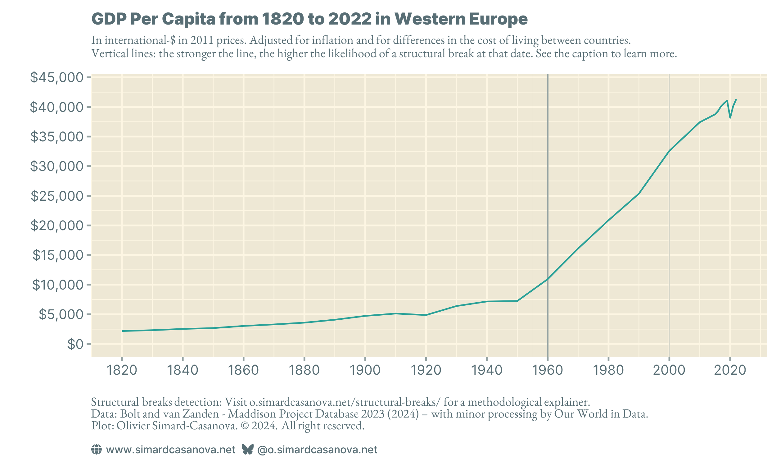
BEAST detects a structural break in 1960. For that year, the data has a time step of five years. The date of the structural break detected by BEAST is imprecise. However, the plot clearly shows that GDP per capita growth accelerated after the Second World War. Historically, this structural break coincides with the rebuilding of a Europe devastated by war.
However, with the naked eye, we can see that there were probably more modest structural breaks well before the Second World War. This is even likelier given the well-established fact that the Industrial Revolution began in Europe in the 19th century. Probably because the data is too irregular and has many missing values, BEAST fails to detect structural breaks of lesser magnitude. The strong post-World War II increase “flattens” the y-axis scale, making structural breaks of lesser magnitude probably more difficult to detect too (my upcoming BEAST article in the “Statistics and Data” section will explain why I have this suspicion). As the data in the next article is yearly data, BEAST will be able to detect more structural breaks.
The second wave: the Global South
Let’s turn our attention to the evolution of GDP per capita in three regions of the Global South: Latin America, the Middle East and North Africa (MENA), and East Asia.
Let's begin with Latin America, with Figure 4.
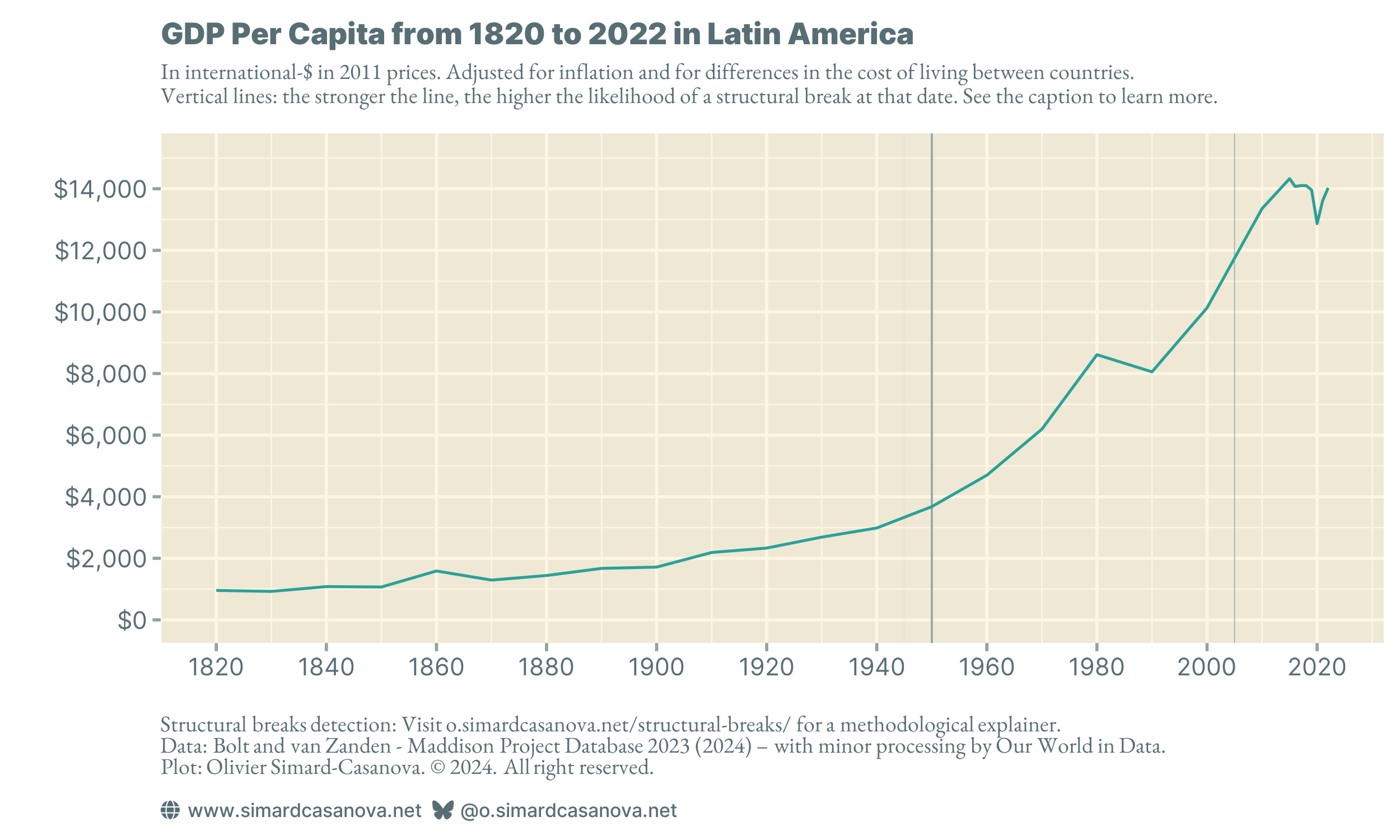
As for Western Europe, BEAST detects a structural break in the 1950s. It detects a second, albeit with less likelihood, structural break in the early 2000s. Even though South America was spared during the Second World War, which in turn created no need to rebuild after 1945, GDP per capita nevertheless rose from around $3,750 a year in 1950 to almost $9,000 a year in 1980.
Figure 4 shows a downturn at the beginning of the 1980s. The region's GDP per capita suddenly fell and rose again in the 1990s. I am not sufficiently familiar with the economic history of South America to identify the country (or countries) at the origin of this downturn. Argentina did experience a major crisis in the 2000s, but it took place twenty years after the break. And I don't know if Argentina has enough weight to influence the average for the whole of South America.
Why doesn't BEAST seem to detect the crash of the 1980s? There are probably two reasons. The first is that the data have large time steps: one observation every five years. The second is that the slope of the curve before and after the break are close, if not identical. BEAST detects structural breaks by comparing the slope of the time series for different sub-intervals. Hence, why BEAST may not have detected it.
Let's continue with the Middle East and North Africa, with Figure 5.
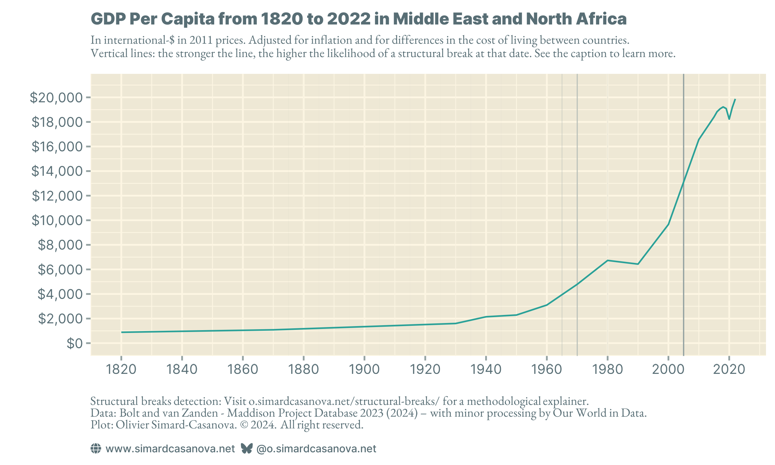
BEAST detects a possible structural break at the end of the 1960s, and a second possible structural break with much greater likelihood in 2005. I do not claim that this is necessarily the explanation. However, it seems to me at least possible that the break in the 1960s could be due to decolonization. The 2005 break corresponds to the similar break visible in Figure 4 for South America.
Like South America, the region experienced a plateau in the 1980s. I am not sufficiently familiar with the region's history to identify a possible explanation for this plateau.
Finally, East Asia. Not all East Asian countries are part of the Global South. Japan and South Korea are not. East Asia is a mix of developed and developing countries.

BEAST detects two structural breaks: the first in the 1960s, the second in the 2000s. I am tempted to interpret the first structural break as the rebuilding of Japan after the Second World War, in a similar vein to that of Western Europe. The second structural break is probably caused by China's significant economic development from the 2000s onwards.
So far, East Asia is the only world region in which GDP per capita has not fallen during the COVID-19 pandemic. Is this the effect of a better management of the pandemic by the countries in the region, possibly built upon the experience they gained with the SARS epidemic in 2003?
The other waves
Finally, I would like to look at three regions that are a bit different from the others. These are the two poorest regions, South and South East Asia and Sub-Saharan Africa, and Eastern Europe.
Let's start with South and South East Asia, with Figure 7.
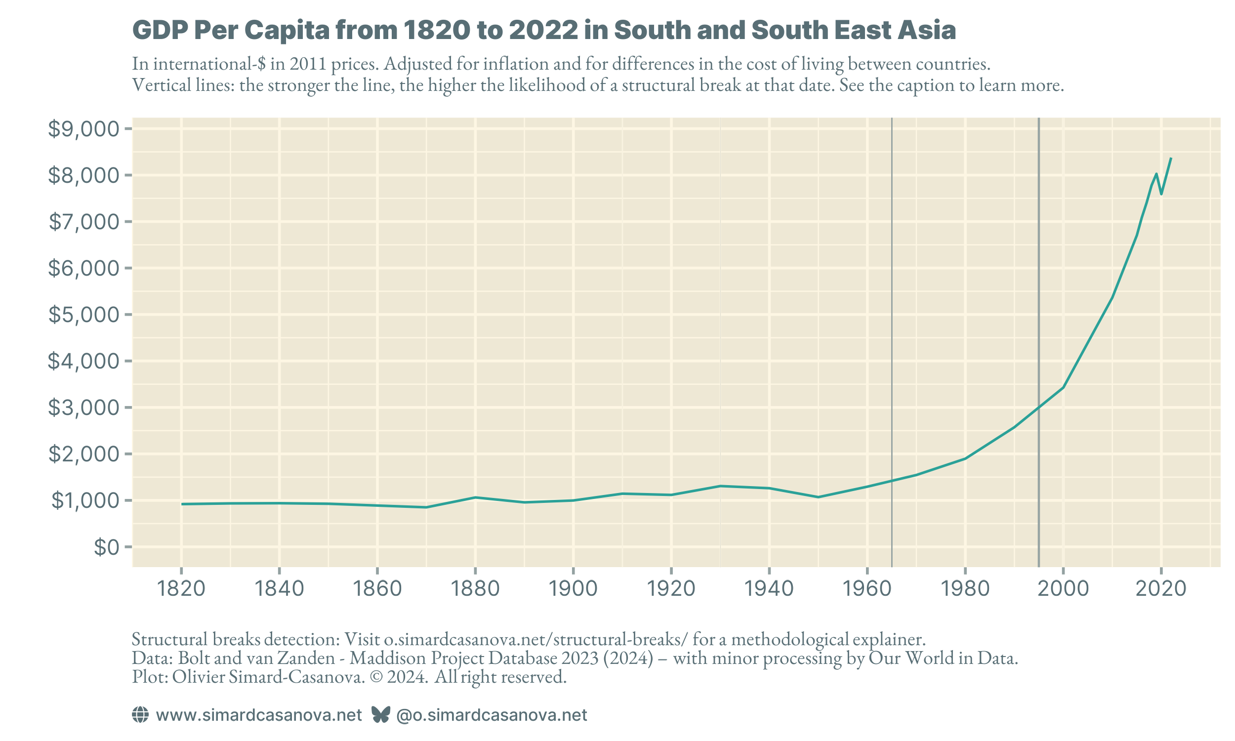
Like most of the regions studied to date, BEAST detects that South and South East Asia experienced an acceleration in GDP per capita growth in the 1990s. The difference with other regions lies in the scale of the y-axis: where Figure 4, Figure 5, and Figure 6 range from $15,000 to $20,000 per year, Figure 7 stops just under $9,000 a year.
South and South East Asia is developing, but as can be seen in Figure 2, it is still a long way from reaching the GDP per capita of other world regions.
Let's continue with Figure 8 and Sub Saharan Africa. The y-axis shows that it is the region with the lowest GDP per capita of all the regions studied so far.
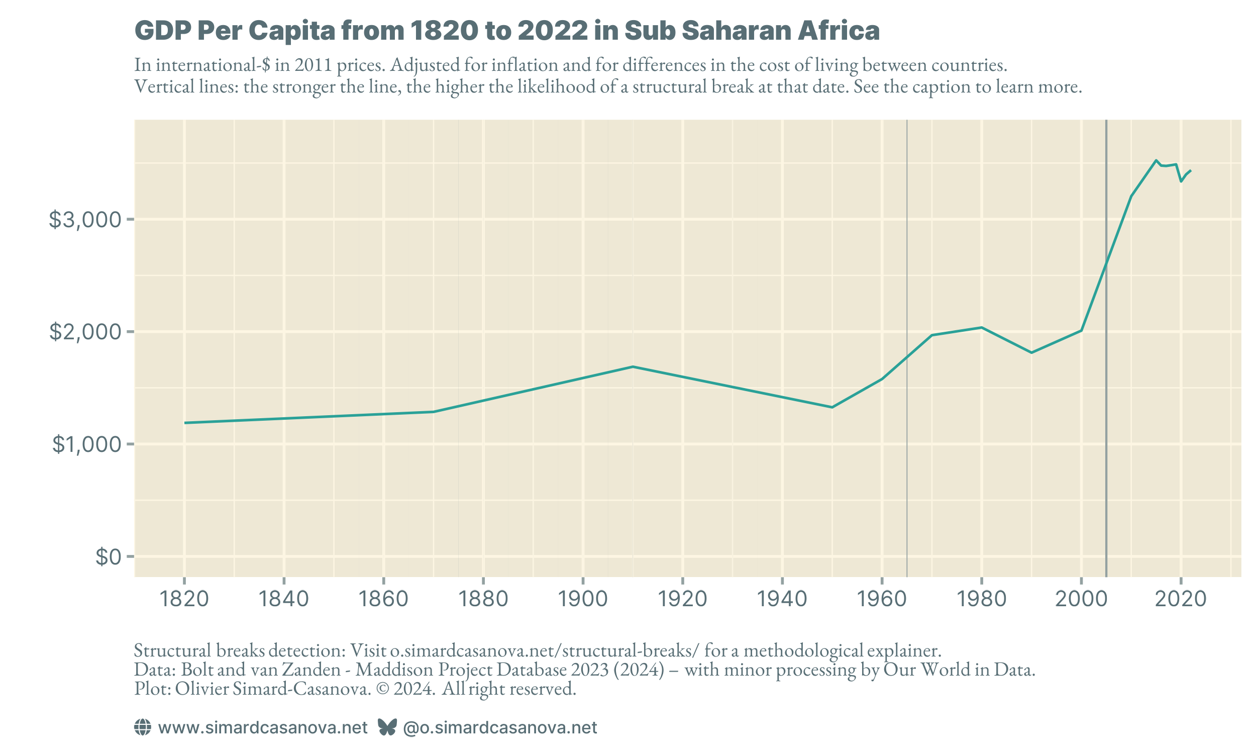
BEAST detects a possible structural break in the 1960s. This is me speculating, but it could correspond to the decolonization of several countries in the region, finally freed from the grip of European colonialist countries.
In the 2000s, BEAST detects a structural break. This is clearly visible on the plot: GDP per capita rises significantly. Similarly with South and South East Asia, however, GDP per capita remains at a low level: the y-axis stops at just over $3,500 per year.
Finally, I would like to focus on Eastern Europe, in Figure 9. This region experienced a singular historical event in the early 1990s: the fall of communism. The fall of communism deeply transformed the political, social and cultural organization of the former communist countries. The economic system was also deeply transformed.
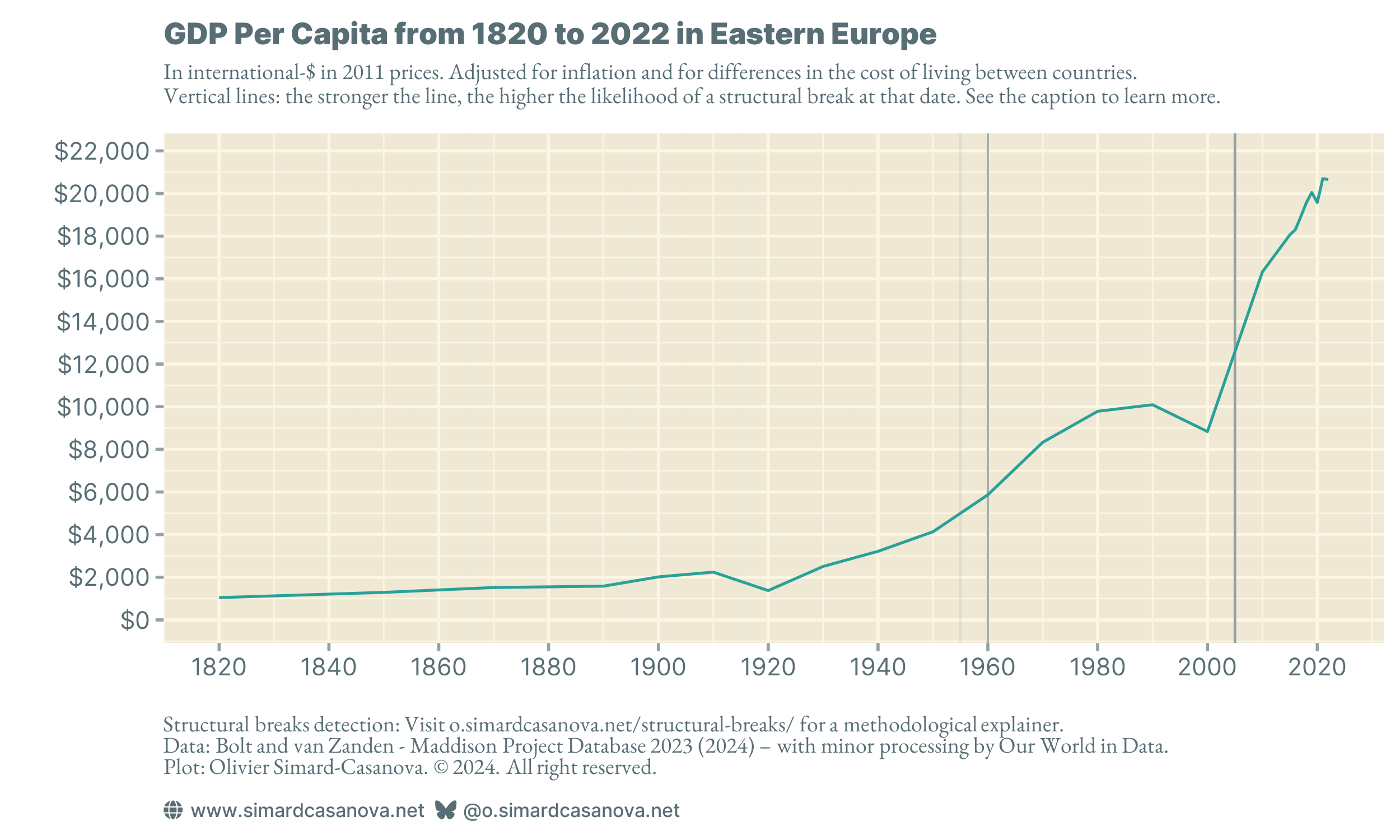
BEAST detects two structural breaks. The first occurred in the 1960s. It may well be the same rebuilding that took place in Western Europe after the Second World War. The second structural break is dated by BEAST to 2005 and corresponds, at least in part, to the rebound following the fall of communism.
The fall of communism is visible on the plot: GDP per capita fell sharply in the 1990s. However, many former communist countries experienced significant economic growth from the 2000s onwards, catching up with, and then largely overtaking, the recession caused by the fall of communism. Some Eastern European countries, such as Poland, have caught up with the GDP per capita of Western Europe. Others, like Russia, are stagnating. The former communist countries remain heterogeneous.
A matter of trade-offs
Figure 1 shows that global GDP per capita has undergone two structural breaks: the first after the Second World War, the second in the early 2000s. If we look in detail at each of the world regions, we can see that most of them experienced structural breaks at both periods. But not all of them.
The acceleration in the growth of GDP per capita at the turn of the millennium virtually everywhere in the world coincides with the development of the current globalization. Globalization is a process in which free trade between countries is generalized. It has been known for two centuries that trade between two countries increases economic growth in both, a result that has since been widely empirically confirmed. It seems likely to me that the acceleration of the 2000s was caused by globalization, although I may want to explore the scientific literature on the subject. If you are interested in such an exploration, please let me know in the comments.
Despite the upward trend in GDP per capita around the world, significant disparities remain, as shown by the often-different scales of the y-axis in the figures.
In addition to the economic interpretation, there is also a methodological lesson to be learned from the data. Figure 1 is a global average. An average aggregates information from the various observations it summarizes. This aggregation “flatten” trends specific to different world regions in a single value. And since trends in the world regions are themselves averages, they mask trends in the countries that make them up.
Aggregating data is convenient because instead of having multiple regional or national curves in a plot, we can settle for a unique curve that summarizes the evolution of regions and countries. However, this unique curve loses information. For example, it is impossible to detect the fall of communism in the world average, a phenomenon that had a considerable impact in Eastern Europe.
Obviously, I am not saying that it is a bad idea to aggregate data to summarize it. Data aggregation is useful. Rather, I am saying that aggregation is not without limitations. Like all statistical work, aggregating data involves making trade-offs. You win in some areas, you lose in others. And depending on what you want to study, or the message you want to convey, you may settle on different trade-offs while working on the same data. You simply must be aware of what you lose, and what you gain, in each alternative.
In the next article in this series, Explainer #1c, I will be exploring GDP per capita in several countries, including France and the United States. Because the data is yearly, and the series often spans over several centuries, I will be able to explore historical evolutions and structural breaks in even greater detail. However, I will lose some generality, since the economic history of one country does not necessarily provide information on the economic history of other countries. Here, too, there is a trade-off.
To make sure you do not miss the next article, you can subscribe to my newsletter.
If you enjoyed this article, please share it with people you know who might be interested. It is through word-of-mouth that I can make my work known. Thank you!
Olivier